Digital Interface Design
Introduction — UX, UI & Design Thinking
Defining UX and UI
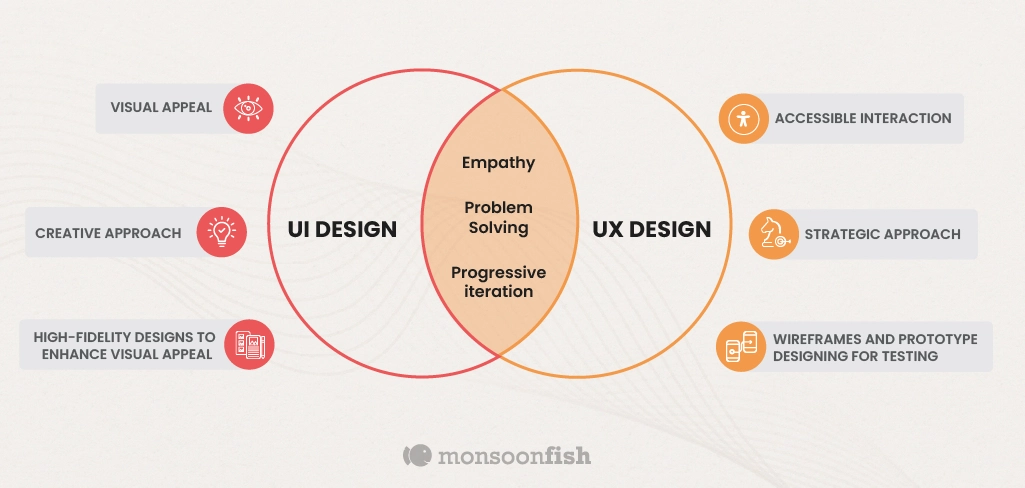
UX Design — “User experience encompasses all aspects of the end-user's interaction with the company, its services, and its products.” (Don Norman, co-founder of the Nielsen Norman Group, who coined the term in the 1990s). In practice:
- Understand user needs, behaviors, and motivations through research
- Structure a coherent logic and flow for the product
- Ensure the product is useful, usable, and desirable
- Applies to digital products AND physical objects
UI Design — The design of visual and interactive elements. In practice:
- Design every screen and component the user interacts with
- Create digital products that are aesthetically pleasing AND functional
- Covers: layout, components (buttons, menus, forms), typography, color, iconography
Key distinction: UX = why and how (structure, flow, logic) · UI = what and with what (appearance, components, style). Metaphor: UX = the skeleton and nervous system · UI = the skin and clothes. The two are inseparable in any successful digital product.
Source: Nielsen Norman Group — UX vs UI · CareerFoundry
Core UX Disciplines
| Discipline | Role |
|---|---|
| User Research | Understand needs, motivations, and behaviors |
| Business Analysis | Align product goals with business strategy |
| Information Architecture | Structure and organize content |
| Content Strategy | Plan and map content (including microcopy) |
| Interaction Design | Define interactions, animations, behaviors |
| Graphic Design | Aesthetics, color, typography, interface quality |
Roles in the Industry
| Role | Responsibilities |
|---|---|
| UI Designer | Hi-fi interfaces, design systems, animations, branding |
| UX Designer | Research, IA, lo-fi wireframes, testing |
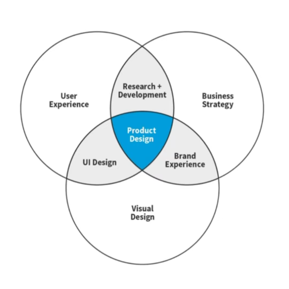
| Product Designer | UX+UI hybrid — dominant in the tech industry |
| UX Researcher | Full-time user research (larger teams) |
| UX Writer | Microcopy, navigation labels, error messages |
| UX Engineer | Coded prototypes, design system integration |
The boundary between roles depends on team size. On a small team, one person wears several hats.
Design Thinking
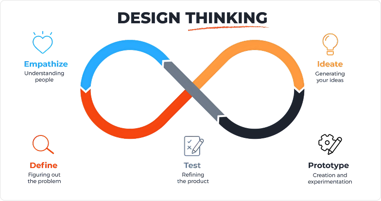
A human-centered, iterative, non-linear approach. Combines empathy, creativity, and rationality. Aligns what is desirable (users), feasible (technical), and viable (business). It is a mindset, not a rigid process.
| # | Phase | Goal | Methods |
|---|---|---|---|
| 1 | Empathize | Understand the users | Interviews, observation, empathy maps |
| 2 | Define | Frame the problem | Problem statement, POV |
| 3 | Ideate | Generate ideas | Crazy 8s, SCAMPER, brainstorming |
| 4 | Prototype | Build and experiment | Wireframes, prototypes |
| 5 | Test | Validate with real users | Usability testing |
You loop back as you learn. Testing can send you back to redefining the problem. Iteration is the norm, not the exception.
Interface Design Tools
| Tool | Status | Notes |
|---|---|---|
| Figma | Industry standard | Real-time collaboration, free (starter plan), web and desktop |
| Sketch | Mac only | UI design pioneer (2010), losing ground to Figma |
| Adobe XD | Declining | Adobe ended active development in 2023 |
| Penpot | Open source | Free, self-hostable, rising alternative |
The Figma Ecosystem
| Tool | Category | Purpose | When to use it |
|---|---|---|---|
| Figma Design | Core | Primary UI design | Wireframes, mockups, prototypes, design systems |
| FigJam | Collaboration | Collaborative whiteboard (≈ Miro) | Brainstorming, affinity diagrams, user flows, card sorting — early in the process |
| Figma Slides | Presentation | Presentation tool (≈ PowerPoint) | Present work to clients or the team |
| Dev Mode | Handoff | Developer handoff mode | Inspect CSS, spacing, colors, export assets |
| Figma Make | AI / Code | AI-assisted prompt-to-code | Turn a design or a description into a working prototype or app |
| Figma Sites | Publishing | Build and publish dynamic websites | Launch a site straight from Figma |
| Figma Draw | Illustration | Advanced vector tools | Illustration, iconography, high-fidelity graphic design |
| Figma Buzz | Marketing | Marketing content creation | Banners, social media, slides — a Canva alternative |
Source: Config 2025 — Figma Blog
Real-time multi-user collaboration · Web platform (no local file management) · Rich plugin ecosystem · Components, variants, variables, shared libraries · Dev Mode for developers · Massive community
Research & Understanding
UX/UI Brief
A short document that turns a vague request into a clear, actionable problem. Serves as a shared reference between client, designer, and team. A living document — it can be revised as the project unfolds.
| Component | Description |
|---|---|
| Context | Why this project exists, what the history is |
| Problem | A clear statement of the user or business problem |
| Target audience | Who will use the product |
| Objectives | What the business wants to achieve |
| KPIs / success metrics | Conversion, retention, satisfaction, NPS… |
| Constraints | Budget, timeline, technical, legal |
| Deliverables | Wireframes? Prototype? Hi-fi? Design system? |
| Stakeholders | Who decides, who approves, who executes |
A brief that's too vague (“we want a modern site”) · A feature list with no defined problem · No success metrics · Confusing business goals with user goals
Sample brief — Vinyless App
Project name: Vinyless —
Mobile app redesign
Company: Audio streaming
service, 300,000+ users, 3 years in
business
Need: New mobile app
(full design)
Why: Aiming for rapid
growth, current app underperforming, need
for differentiation in a saturated
market
Vision: A trendier visual
direction, graphic elements tied to vinyl
and audio
Target audience: 18–34
year-olds, disposable income, social media
savvy
Platforms: Mobile
(priority), desktop (secondary assets)
Deliverables: AI, EPS, PDF
files
Deadline: November 6 ·
Budget:
$3,500
Contact: Andy (founder)
+ Claire (Head of Design)
Source: Twine — Example UX Project Brief
User Research
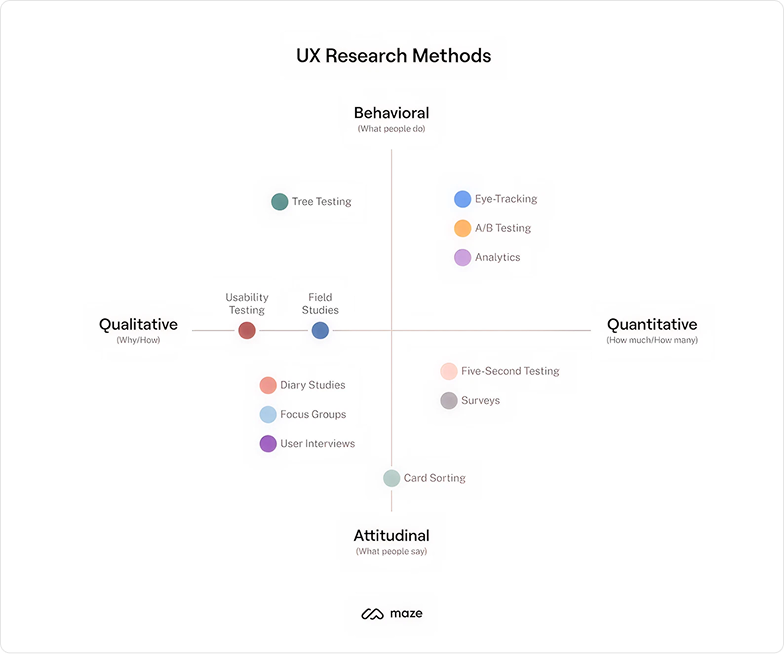
Methods for understanding user behaviors, needs, and motivations. Reduces assumptions, validates or invalidates intuitions. Separates what people say from what they do.
| Qualitative | Quantitative | |
|---|---|---|
| Nature | The “why” | The “how many” |
| Approach | Opinions, motivations, feelings, contexts | Numerical and statistical, measurable patterns |
| Methods | Interviews, focus groups, observation, ethnography | Surveys, analytics, A/B testing, heatmaps |
| Sample | Small, analytical depth | Large, generalizable |
Other distinctions
Attitudinal (what people say) vs behavioral (what they do) · Generative (discover) vs Evaluative (validate)
Analytics tools
| Tool | Purpose | Link |
|---|---|---|
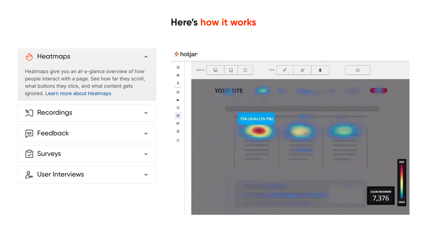
| Hotjar | Heatmaps, session recordings, surveys — understand real behavior on the product | hotjar.com |
| Google Analytics | Web analytics — traffic, conversions, visitor behavior | analytics.google.com |

Interviewing best practices
- Open, non-leading questions
- Ask “why” repeatedly to dig deeper
- 4 to 6 participants, 15–45 minutes each
- Use a screener to recruit the right people
- Record (with consent)
STAR Method
| Letter | Meaning |
|---|---|
| S | Situation — the context |
| T | Task — the objective |
| A | Action — what gets done |
| R | Result — what changes |
Ref.: UX Design Institute — STAR Method
Competitive Research
A systematic analysis of competing and comparable products. Identifies industry standards, best practices, and differentiation opportunities.
| Competitor type | Example |
|---|---|
| Direct | Same product, same audience (Slack vs Microsoft Teams) |
| Indirect | Different product, same need (Slack vs email) |
| Aspirational | Outside the industry but admired for their UX (e.g. Stripe for its docs) |
Tools: Mobbin · Page Flows · Behance · Dribbble


Persona
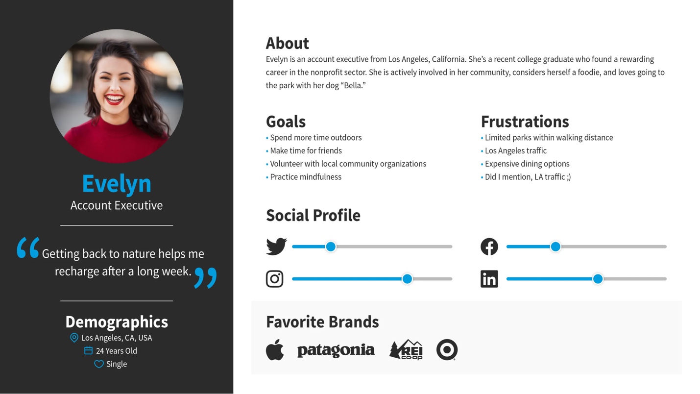
A fictional profile based on real data, representing a target user type. Serves as a shared reference for design decisions (“Who are we designing for?”).
| Component | Description |
|---|---|
| Name, photo, age, occupation, context | Realistic grounding |
| Goals / motivations | What the user wants to accomplish |
| Frustrations / pain points | What blocks or annoys them |
| Key behaviors | Digital habits and usage context |
| Representative quote | The user's voice in one sentence |
| Tech level + tools used | Skill and environment |
A stereotyped persona with no data → useless fiction · A persona that describes everyone → describes no one · Maximum 4 personas (beyond that they lose their value)
User Flow
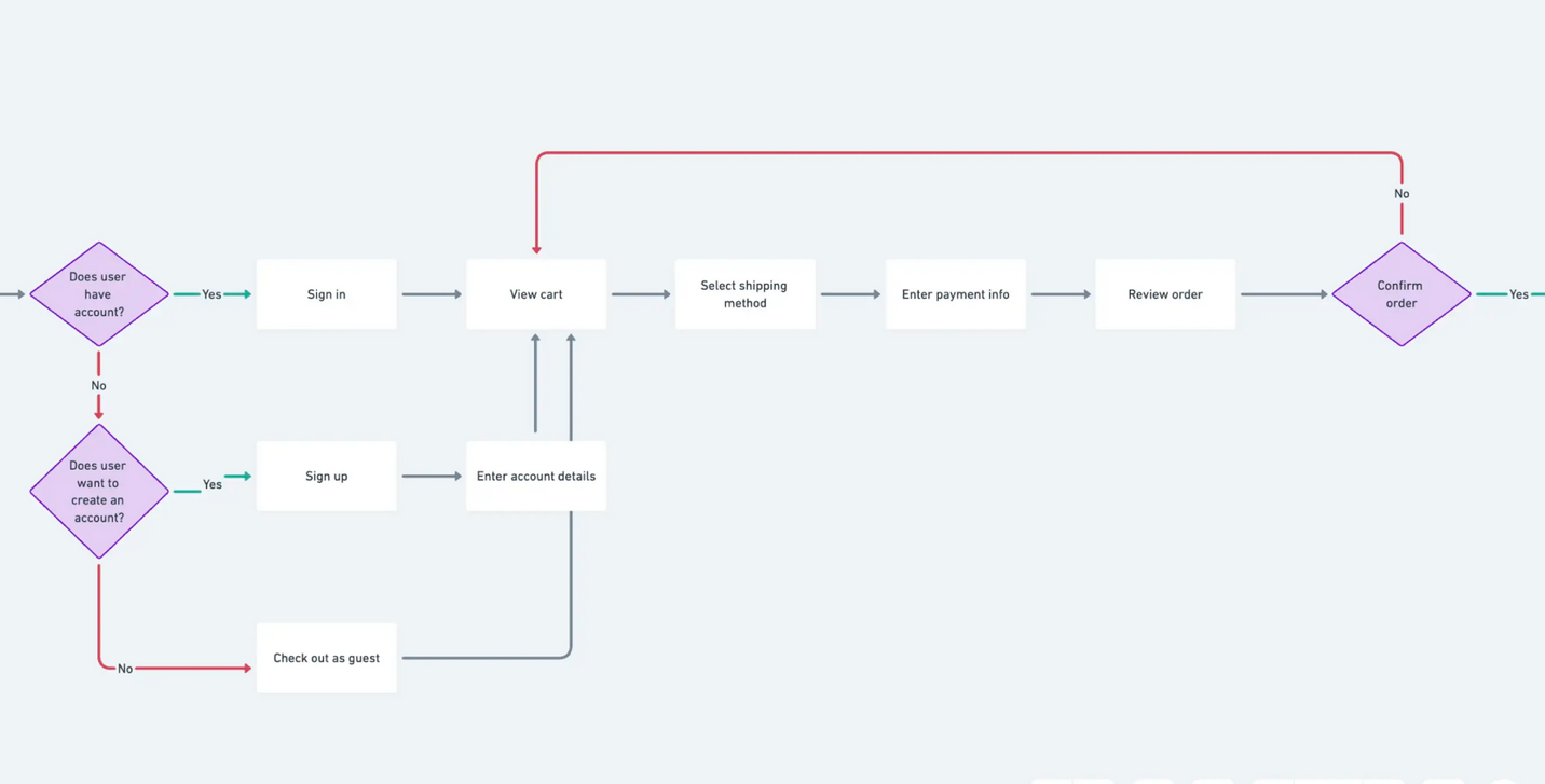
A visual representation of the path a user takes to complete a task. Shows screens, decisions, actions, and error states. Focus: the sequence of interactions, not emotion.
| Symbol | Meaning |
|---|---|
| Rectangles | Screens / pages |
| Diamonds | Decision points (yes/no) |
| Arrows | Transitions |
| Annotations | Error or validation states |
When to do it: before wireframing, to validate that the path is logical and identify missing screens.
Tools: Whimsical · FigJam · Miro · Lucidchart
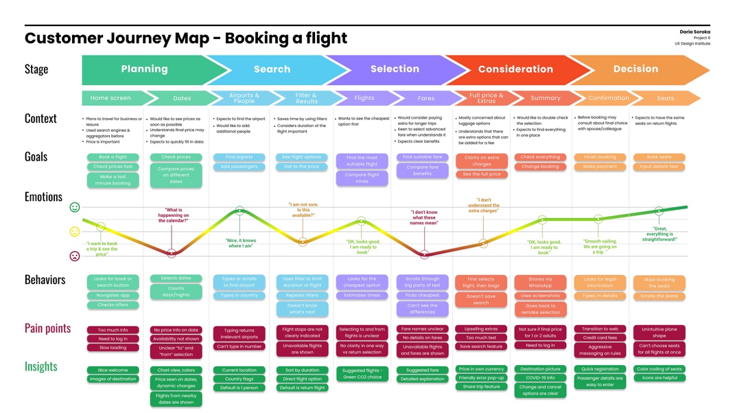
User Journey
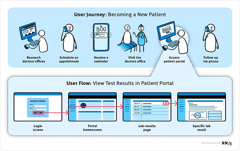
A visual or narrative map of the extended user experience. Covers every stage — before, during, and after the interaction. Includes emotions, touchpoints, channels, and moments of friction. A wider lens than the user flow.
| User Flow | User Journey | |
|---|---|---|
| Focus | Sequence of actions in the product | Overall experience including emotions and context |
| Content | Screens, decisions, branches | Stages, touchpoints, thoughts, opportunities |
| When | Before wireframing | Service redesign or aligning a team |
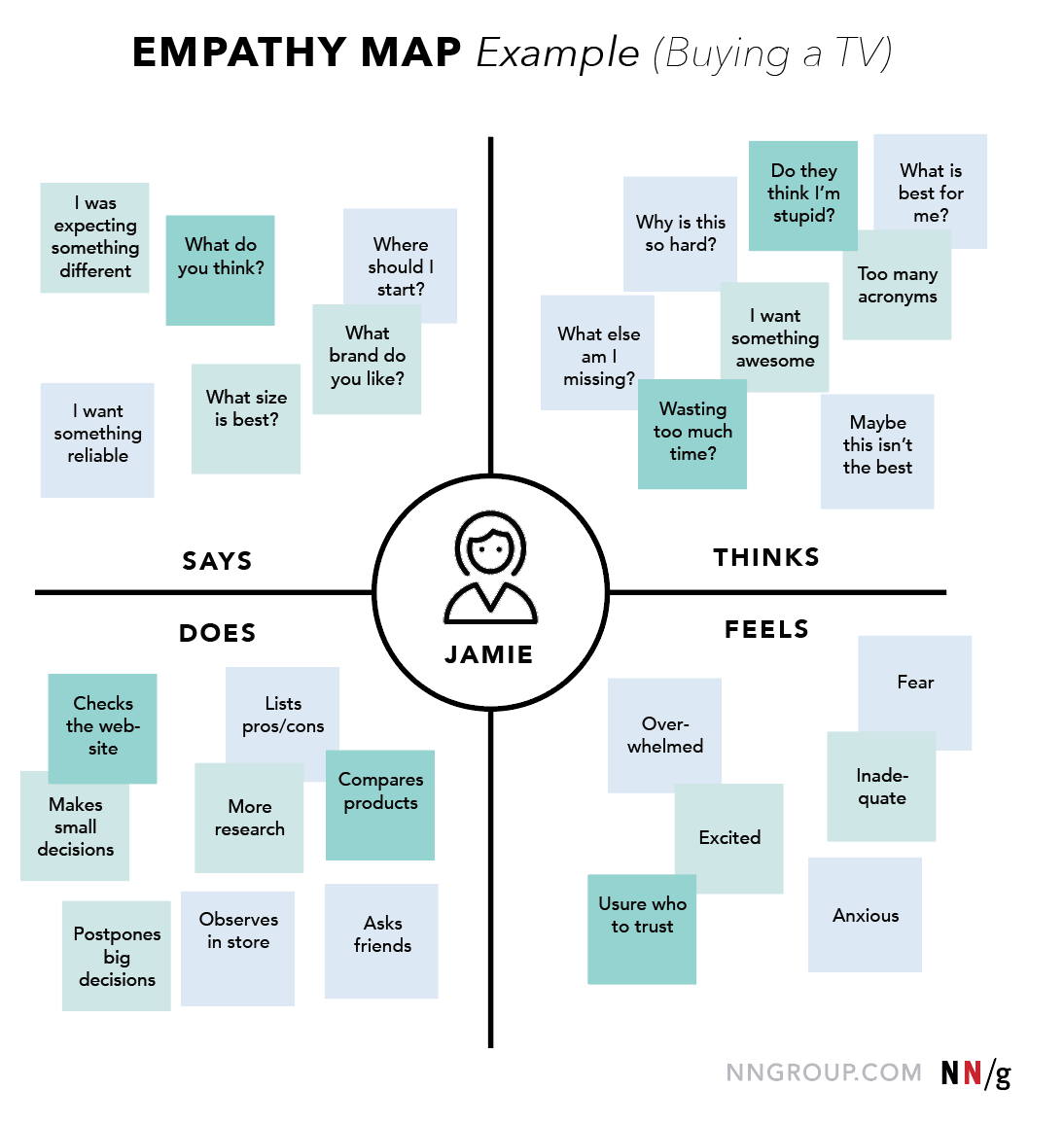
Empathy Map
A visual tool for synthesizing what a user says, thinks, does, and feels. Aligns the team on a shared understanding of the user.
NN/g — UX Mapping Cheat Sheet (Personas, Journey Maps, Experience Maps, Mental Models)
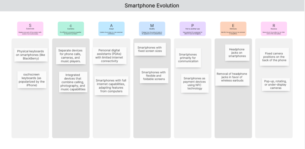
SCAMPER
An ideation technique built on systematic questioning. An acronym that forces you to explore an idea from 7 angles. Used to evolve an existing concept.
| Letter | Move | Question |
|---|---|---|
| S | Substitute | What if we replaced X with Y? |
| C | Combine | What if we merged X and Y? |
| A | Adapt | How could we borrow an idea from another context? |
| M | Modify | How could we amplify or reduce it? |
| P | Put to other use | What other uses are possible? |
| E | Eliminate | What can we remove or simplify? |
| R | Reverse | Invert the order, do the opposite? |
Ref.: CareerFoundry — SCAMPER Technique
MVP — Minimum Viable Product
Definition
- The smallest version of a product that delivers enough value to be tested
- Lets you learn fast with minimal investment
- Answers the question: “What is the smallest product that solves the problem?”
Principles
- Not an incomplete product, but a complete product for a minimal use case
- Aims to validate a hypothesis, not to please everyone
- Iterates on real user feedback
MAYA — Most Advanced Yet Acceptable
Definition
- A principle coined by Raymond Loewy (20th-century industrial designer)
- “Design for the future, but balance it with where users are today”
- Offer the most advanced design users are able to accept and adopt
- A distant cousin of Jakob's Law (users prefer what they already know)
Principles
- Evolve the design gradually
- Include familiar patterns in the design
- Leverage users' current skills and mindset
- Let users intuitively understand the product
Too conservative → a boring, undifferentiated product · Too avant-garde → rejection, too steep a learning curve · MAYA = the balance between innovation and familiarity
Examples
- Tesla innovated on the driving experience but kept a round steering wheel
- Slack replaced email but kept the “channels” metaphor
Psychological Foundations
Users are not rational — they are biased, distracted, cognitively limited. Understanding how the human brain works = anticipating behavior. The laws and cognitive biases give you a vocabulary to explain and defend design decisions. They provide the theoretical base for heuristics (practical rules) and ethics (avoiding dark patterns). Key references: Laws of UX (lawsofux.com) and Growth.Design
Foundational Laws
The time to reach a target depends on its size and its distance.
Apply: Primary action buttons ≥ 44×44 px · Avoid tiny 12 px buttons crammed together

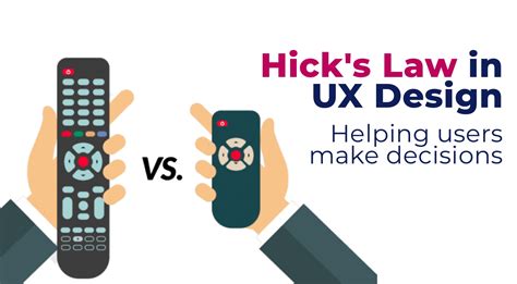
Decision time increases with the number of options available. Can lead to paralysis.
Apply: Keep menus short · Navigation 5–7 items max · Progressive onboarding · See Progressive disclosure
The real limit is closer to 4, but the principle holds.
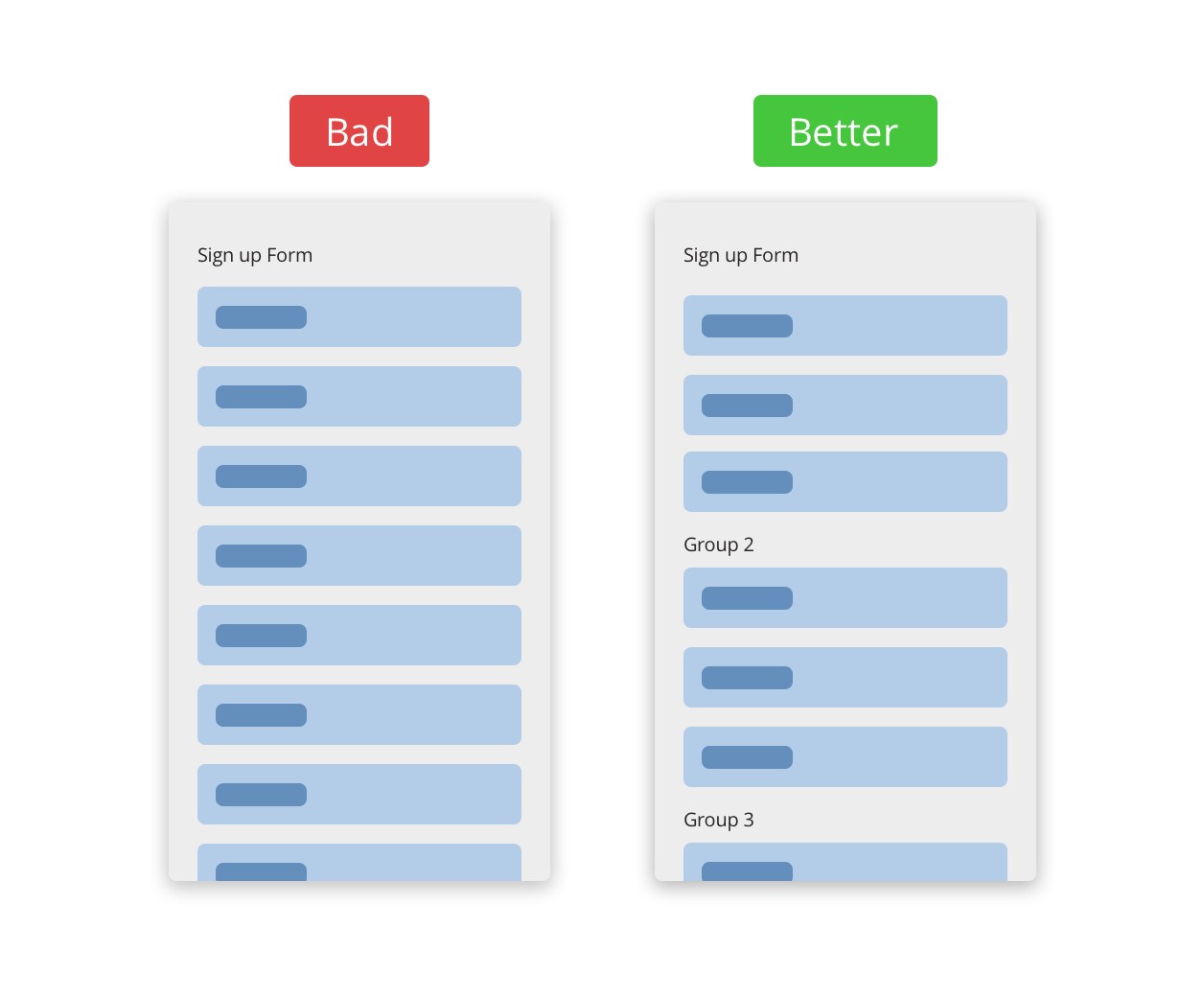
Apply: Group information in chunks of 5–7 · Chunking · Short multi-step forms
Formulated by Jakob Nielsen (2000). Users spend most of their time on other sites — they expect yours to work the same way.
Apply: Logo top left · Cart top right · Hamburger menu on mobile · Blue underline on links · Red for errors

Essential Cognitive Biases
| Bias | Definition | UI application |
|---|---|---|
| Cognitive load | The amount of mental effort required to complete a task | Clean interface · Recognition over recall · Progressive disclosure |
| Anchoring bias | Disproportionate weight given to the first piece of information seen | Crossed-out price + current price · Show the “expensive” plan first for context |
| Aesthetic-Usability Effect | Aesthetically pleasing designs are perceived as easier to use | UI is not cosmetic — it's a lever for perceived usability |
| Serial Position Effect | The first and last items in a list are remembered best | Put priority items at the ends of the navigation |
| Recognition over Recall | Recognizing is easier than remembering | Dropdown menus · Familiar icons · Search history |
| Social proof | People adapt their behavior to what others are doing (Cialdini) | Customer reviews · “Best-seller” badges · “10,000+ customers” |
→ Full list of biases: growth.design/psychology
Nielsen's 10 Heuristics
10 usability principles for evaluating an interface. Published by Jakob Nielsen in 1994. Used for heuristic evaluation.
Examples: progress bar, “Message sent”, loader, “You are here”
Examples: trash icon = delete, shopping-cart metaphor
Examples: Undo, back button, save for later
Examples: standard positions for navigation, cart, account
Examples: autocomplete, real-time validation, disabling impossible dates
Examples: search suggestions, standard icons, recent lists
Examples: keyboard shortcuts, gestures, customization
Examples: clean interface, clear visual hierarchy
Examples: “Password too short (8 characters min.)” instead of “Error 403”
Examples: contextual tooltips, onboarding, accessible FAQ
PDF: Heuristic Evaluation Summary — Nielsen Norman Group · Download
Dark Patterns
Design strategies that push users into actions against their own interests. Increasingly regulated (GDPR, the European DSA, California laws). Ref: deceptive.design
| Pattern | Description |
|---|---|
| Roach Motel | Easy to sign up, hard to cancel (hidden cancellation) |
| Confirm Shaming | Guilt-tripping copy for declining an option (“No thanks, I'd rather pay more”) |
| False Scarcity | Fake scarcity signals (“Only 2 left in stock!”) |
| Countdown | Fake urgency timers to force the decision |
| Nagging | Repeated, aggressive prompts (insistent popups) |
| Preselection | Option pre-checked in the company's favor (annual subscription) |
| Hidden Subscription | Automatically adds a subscription to a one-time purchase |
| Hidden Cost | Extra fees revealed at the last moment of checkout |
| Disguised Ads | Ads disguised as content or as action buttons |
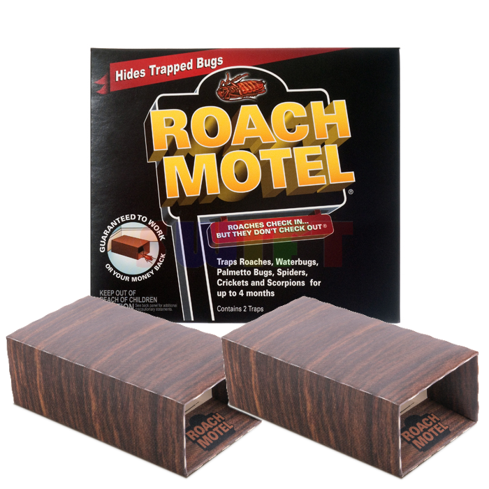
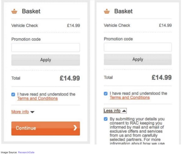
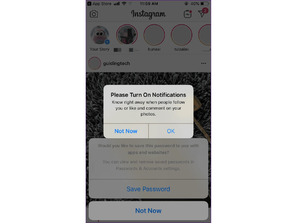
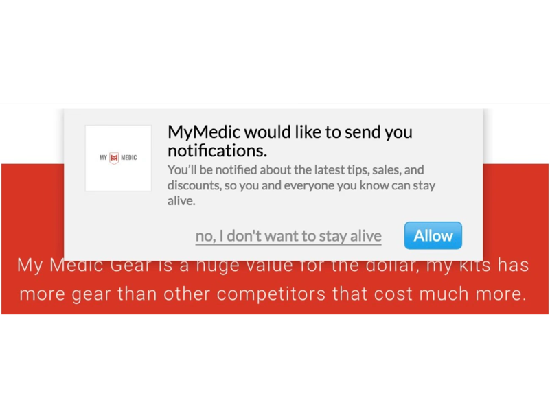
Ref.: DAPDE — Types & Examples of Dark Patterns · deceptive.design
Progressive Disclosure
A design strategy of revealing information in stages. Show the essentials first, expose complexity as needed. Reduces cognitive load (related to Miller and Hick).
| Application | Example |
|---|---|
| Step-by-step onboarding | One field at a time in a form |
| “See more” / “Details” | Truncated content with a CTA to expand |
| Contextual menus | Options that open on demand |
| Advanced settings | Hidden behind a toggle |
| Tooltips | Appear on hover only |
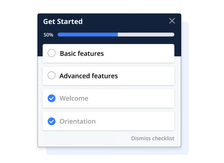
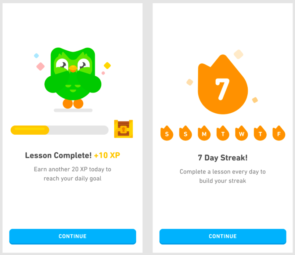
Goal Gradient Effect
Motivation increases as the user gets closer to the goal. Origin: Clark Hull, behavioral psychology, 1932.
| UI application | Example |
|---|---|
| Progress bars | Checkout, onboarding, profile completion |
| Numbered steps | “Step 3 of 4” |
| Gamification | XP, levels, badges close to the goal |
Information Architecture
IA is the invisible skeleton of a digital product. Good IA = users find what they're looking for without thinking. IA comes before wireframing — structure before aesthetics.
Affinity Diagram
A synthesis method that groups raw data into themes. Turns a chaos of observations into actionable patterns. Used after user research or a brainstorm.
| Step | Action |
|---|---|
| 1 | Each observation / quote / insight = one sticky note |
| 2 | Put everything on a wall or virtual board |
| 3 | Group by similarity, with no predefined categories |
| 4 | Groups emerge naturally |
| 5 | Name each group with a theme |
Tools: Sticky notes + a wall · FigJam · Miro · Mural · Whimsical

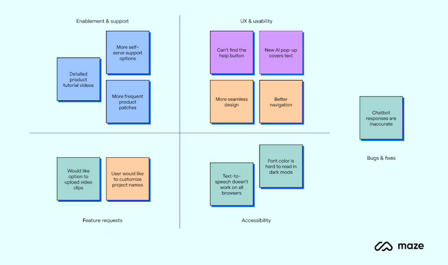
Ref.: Maze — Affinity Diagrams guide
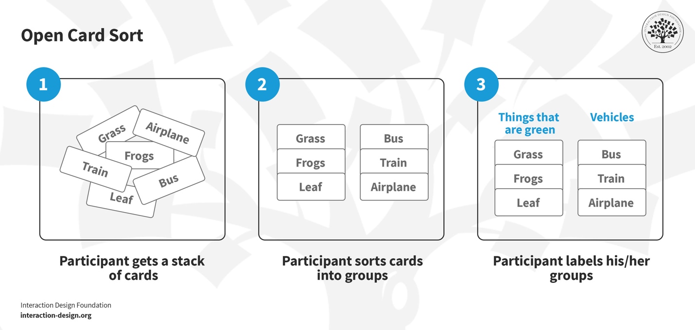
Card Sorting
A method for understanding how users categorize content. Lets you build a user-centered tree structure (not the designer's or the client's opinion). Popularized by Donna Spencer.
| Variant | Description | When |
|---|---|---|
| Open | Participants create and name their own categories | To discover how users think about the information |
| Closed | Predefined categories; participants sort the cards | To validate an existing structure |
| Hybrid | Categories are suggested, but participants can create their own | A compromise — guides while letting things emerge |
Card Sorting: a
research method — real users
sort content to reveal their mental
model.
Affinity Diagram:
a synthesis tool — the team groups
observations from research.
Tools: Optimal Workshop · Maze · UXtweak
Copydeck & Page Nomenclature
A copydeck is the master content document listing all copy, labels, microcopy, and placeholders for every page — created after the tree structure is validated, before Figma design begins.
| Code | Level | Example |
|---|---|---|
0.0 |
Global | 0.0 — Header, Footer |
1.0 |
Main page | 1.0 — About |
1.1 |
Sub-page | 1.1 — About → Team |
1.1.1 |
Sub-sub-page | 1.1.1 — About → Team → Member |
This convention travels consistently: tree structure → sitemap → copydeck → Figma page naming.
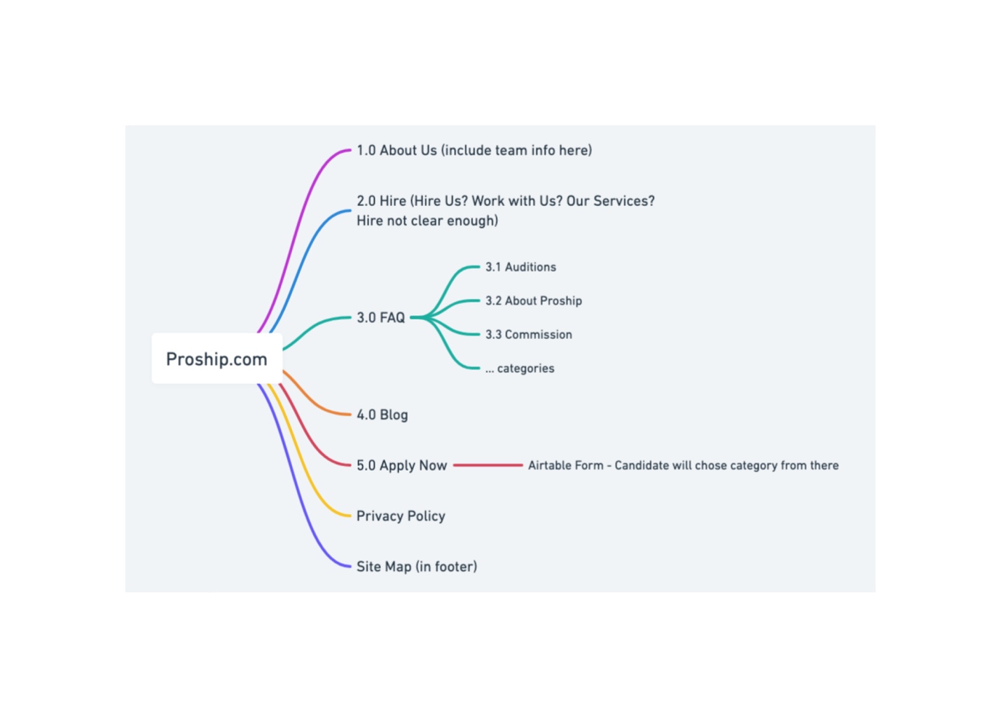
Tree Structure / Sitemap
A hierarchical representation of a product's pages, sections, and subsections. Also called a sitemap. The skeleton of the navigation.
| Rule | Recommendation |
|---|---|
| Depth | 3 clicks max to reach any content |
| Width | 5 to 7 items at the top level (Miller's Law) |
| Mobile | The nav must fit in a hamburger menu or bottom nav |
| Numbering | Hierarchical (1.0, 1.1, 1.1.1) |
Tools: Whimsical · FigJam · Octopus.do · Miro · Lucidchart
The two terms are often used interchangeably. Tree structure = the hierarchical structure of the pages. Sitemap = the visual representation of that structure, sometimes enriched with content annotations. In professional practice, “sitemap” usually refers to the deliverable document (visual, or XML for SEO).
Augmented Sitemap
An evolution of the simple tree structure: content or mini-wireframes are added to each box. The bridge between sitemap and wireframing. Lets you validate the amount of content per page before wireframing.
Dedicated tools: Octopus.do · FlowMapp

Wireframing
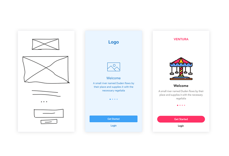
A schematic representation of an interface, without visual design. Focus on structure, hierarchy, and functionality.
| Fidelity | Characteristics | When | Tools |
|---|---|---|---|
| Lo-Fi | Paper or whiteboard sketches. Very fast, cheap. Encourages structural feedback. | Group exploration, rapid iteration | Paper · Procreate · FigJam · Balsamiq |
| Mid-Fi | Digital grayscale wireframes. Clear structure, correct proportions. The professional standard. | Validate the structure | Figma · Sketch · Adobe XD |
| Hi-Fi | Complete mockups with color, type, imagery. The final representation of the design. | Client validation, dev handoff | Figma |
Lo-fi to explore · Mid-fi to validate structure · Hi-fi to deliver. Don't increase fidelity until the previous level is validated. Going hi-fi too early = feedback stuck on colors instead of structure.
Visual Design
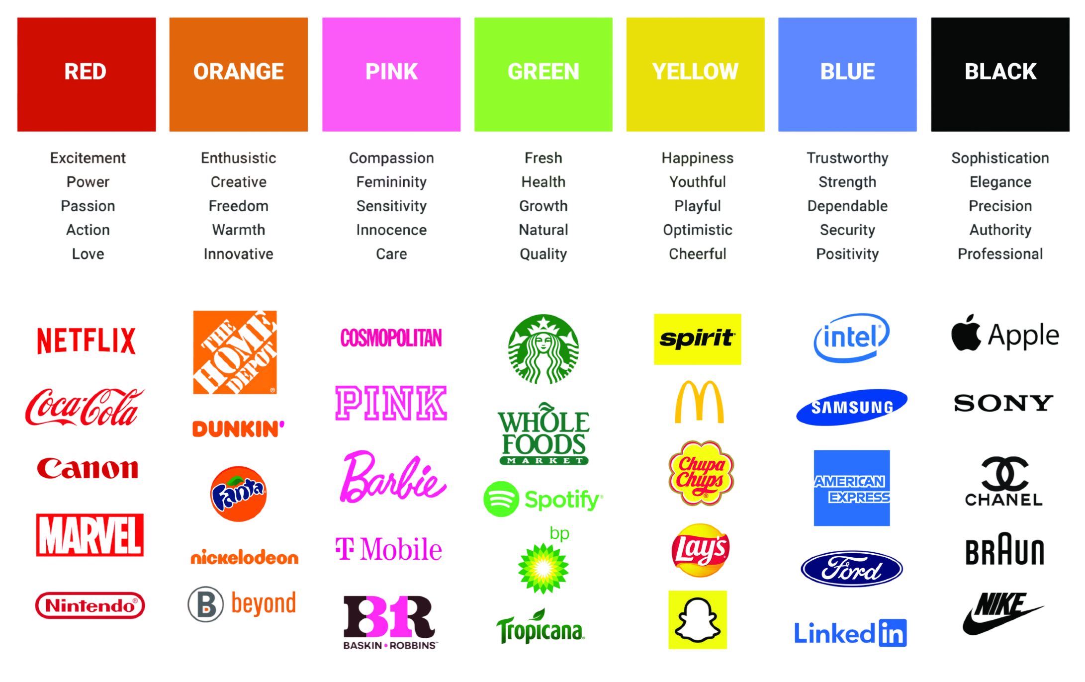
Branding and Personality
Branding is a brand's overall identity: values, tone, personality, aesthetics. Interface design must translate that identity visually. A digital product is a major touchpoint between brand and user. Bad branding = a forgettable product, even a well-designed one.
Why a UI designer must understand branding
- Every visual decision (color, type, tone) must serve the brand
- Without a clear brand direction, you end up generic
- Tied to MAYA and Jakob's Law: the balance between a distinct identity and familiar conventions
Brand guide — typical components
The reference document that codifies a brand's visual and verbal identity. Shared by the whole team (design, marketing, dev, content). Guarantees consistency across every channel.
- Logo and usage rules
- Color palette (primary, secondary, neutral, semantic)
- Typography (families, hierarchy)
- Imagery and photography (style, treatment)
- Iconography
- Tone of voice and writing rules
- Usage examples (do's and don'ts)
Brand archetypes (Jung / Mark & Pearson)
12 universal archetypes from Jungian psychology. Popularized by Margaret Mark and Carol Pearson (The Hero and the Outlaw, 2001). Each archetype has a personality, values, and a tone. They help answer design questions (“would a hero use this color?”).
| Archetype | Brand examples |
|---|---|
| The Innocent | Dove |
| The Sage | Google, Harvard |
| The Explorer | Patagonia, Jeep |
| The Outlaw | Harley-Davidson |
| The Magician | Disney, Apple |
| The Hero | Nike, BMW |
| The Lover | Chanel, Häagen-Dazs |
| The Jester | Old Spice, Skittles |
| The Everyman | IKEA, Levi's |
| The Caregiver | Johnson & Johnson, Volvo |
| The Creator | Adobe, LEGO |
| The Ruler | Mercedes, Rolex |
Quick method — no big branding budget
For projects without a big branding budget (a frequent case for a UI designer):
- Pick 3–4 adjectives that describe the brand
- Define their defensible opposite (what you do not want to be)
- Example: “Trustworthy vs casual”, “Geeky vs boring”, “Humble vs all-knowing”
- Test every visual decision against those adjectives
Moodboard
A visual collection of references expressing an aesthetic direction. Aligns client, designer, and team on the intended feel. A divergence step before converging on the design.
What goes in it
- Screenshots of inspiring sites/apps
- Mood photos
- Color palettes
- Type samples
- Textures and patterns
- Illustrations or graphic elements
- Keywords and adjectives
Best practices
- One direction per moodboard (otherwise it's a grab bag)
- 15–30 references are enough
- Annotate why each reference is relevant
- Present 2–3 distinct directions to the client (not just 1)
- Distinguish the moodboard (overall mood) from UI references (specific components)
Tools: Pinterest · Milanote · FigJam · Behance · Dribbble · Mobbin
Style Tile
The bridge between moodboard (inspiration) and mockup (application). Shows type, colors, buttons, and textures applied to a sample page — without composing a full page yet. Validates the visual direction before going hi-fi.
The HSB Model
More intuitive than RGB or HEX for adjusting a color in UI. Lets you create consistent variations (same hue, different saturation/brightness).
| Component | Description | Usage |
|---|---|---|
| H — Hue | The base color (0–360°) | Keep stable to maintain brand consistency |
| S — Saturation | Vividness (0 = gray, 100 = pure) | Adjust for vivid or muted versions |
| B — Brightness | Lightness (0 = black, 100 = white) | Adjust for light/dark variations |
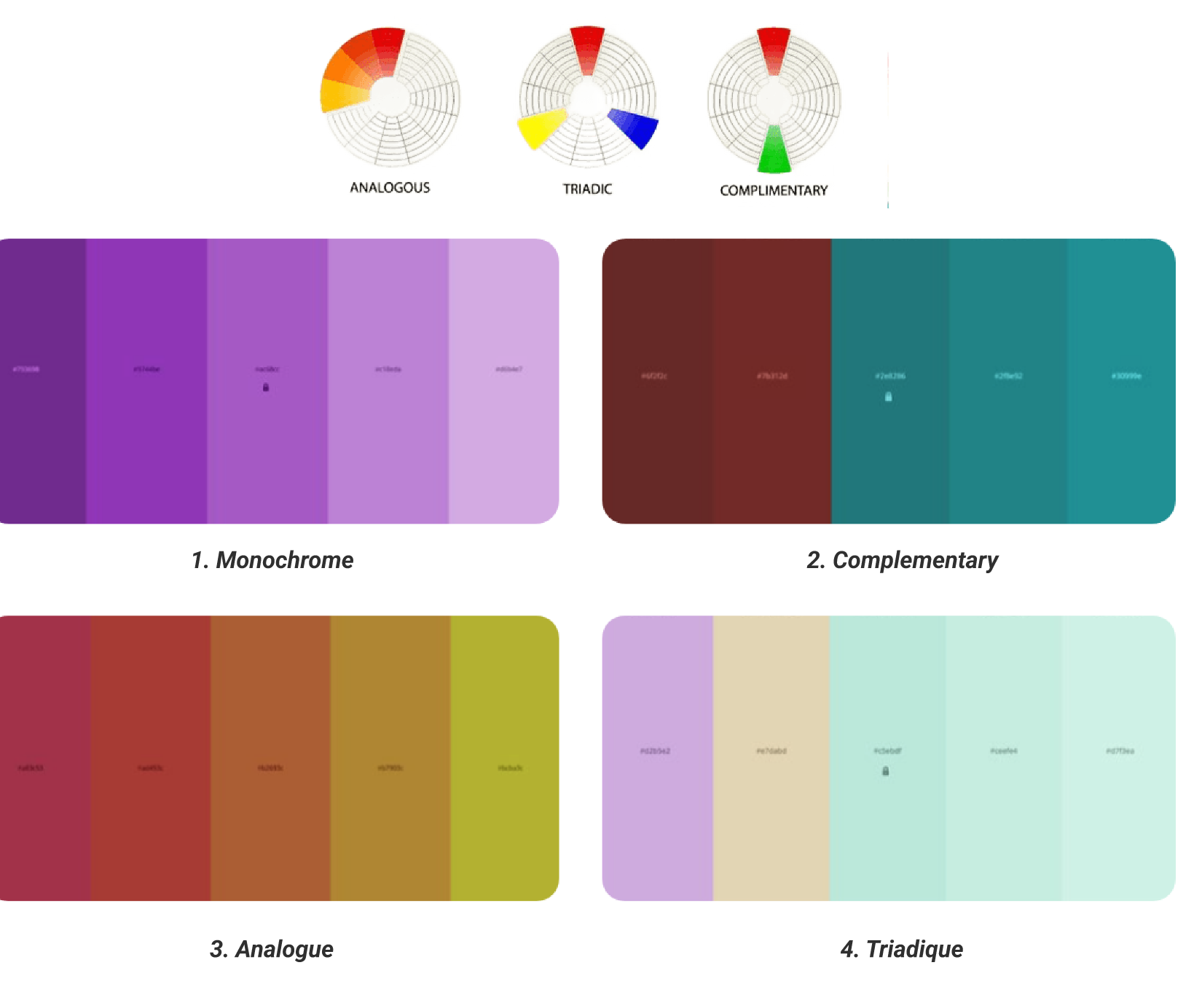
Color Schemes
| Scheme | Description | Character |
|---|---|---|
| Monochromatic | Variations of a single hue | Elegant, understated, safe |
| Complementary | Opposite colors on the wheel | High contrast, use sparingly |
| Analogous | Adjacent colors on the wheel | Harmonious, calm |
| Triadic | Three equidistant colors | Vibrant, energetic, demanding to balance |
The 60-30-10 Rule
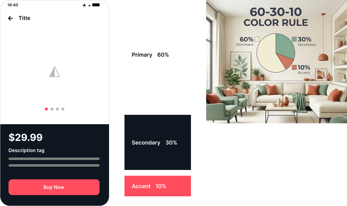
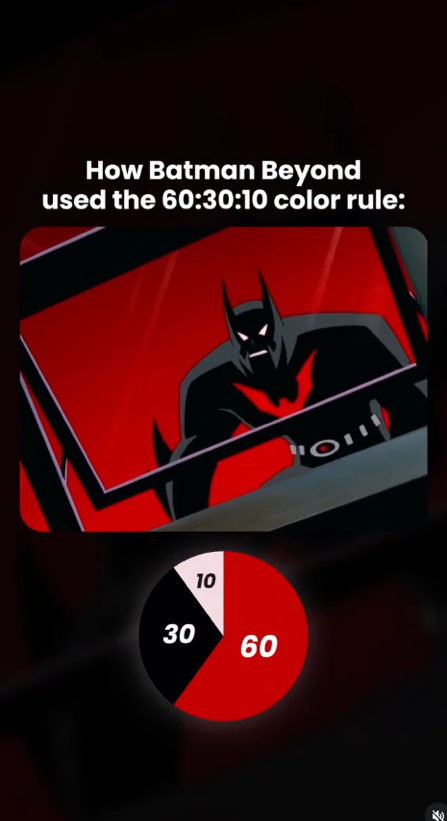
| Proportion | Role |
|---|---|
| 60% | Dominant color (often neutral, structural) |
| 30% | Secondary color (often the brand color) |
| 10% | Accent color (for CTAs and important actions) |
Color Types in a UI Palette
| Type | Role |
|---|---|
| Primary | Dominant brand color(s) |
| Secondary | Support the primary |
| Neutrals | Grays, off-white, soft black — structure the interface (70–80% of the UI) |
| Semantic | Red → error · Green → success · Yellow/orange → warning · Blue → info |
70–80% of an interface is gray. Never pure black (#000000) — too harsh, tiring. Prefer a gray slightly tinted with the brand color. Gray is what makes color shine.
Color and Accessibility
| Situation | Minimum ratio (WCAG AA) |
|---|---|
| Normal text | 4.5:1 |
| Large text (18pt+ or bold 14pt) | 3:1 |
| UI elements (buttons, icons, borders) | 3:1 |
Never rely on color alone to convey information — pair it with icons and labels. 8% of men have some form of color blindness.
Tools: WebAIM Contrast Checker · Stark plugin in Figma
Dark Mode
- Standard since ~2019 on most platforms
- Not a simple color inversion
- Prefer a very dark gray background (never pure black, except OLED)
- Slightly increase color saturation in dark mode
- Test every component in both modes
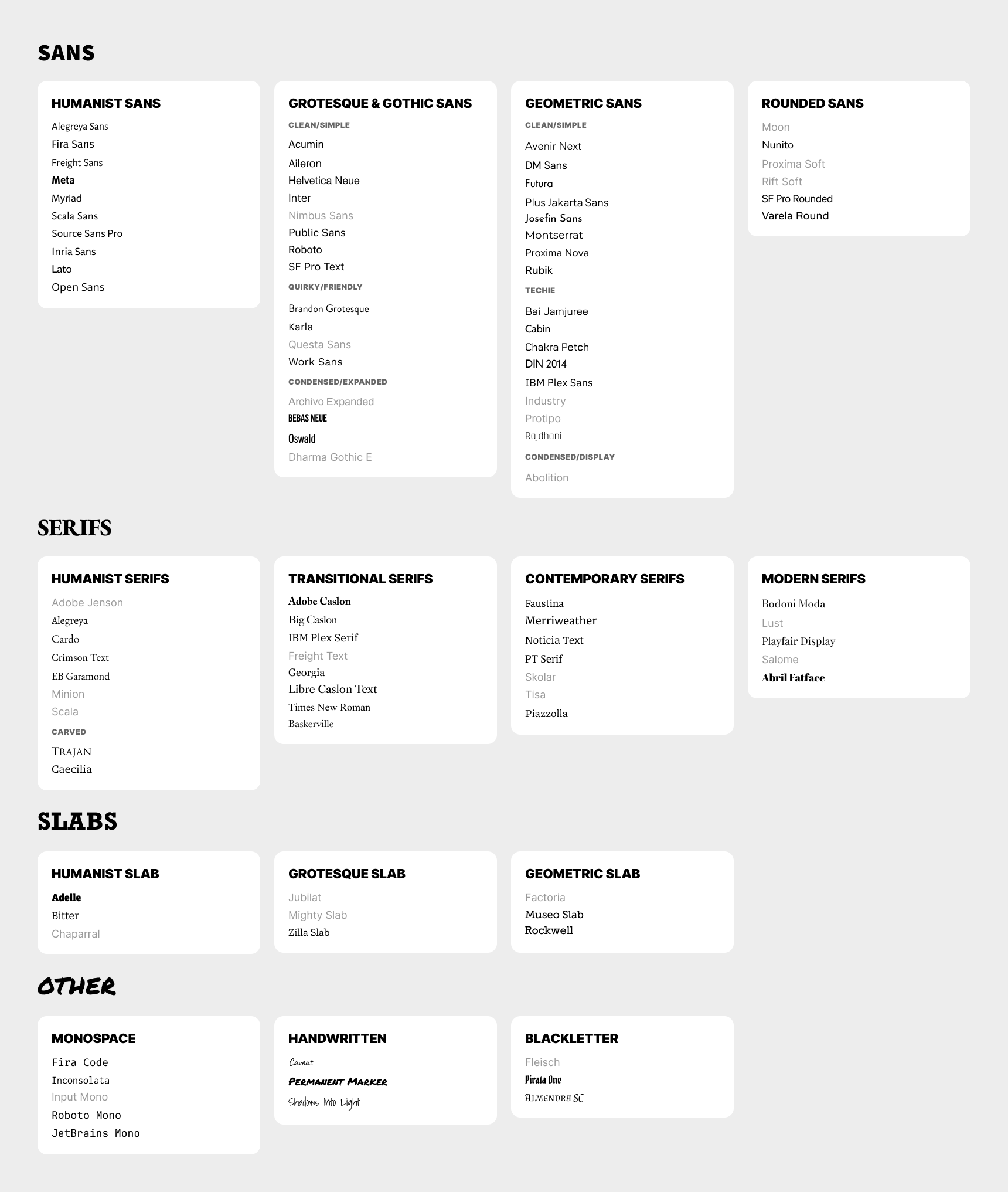
Typeface vs Font
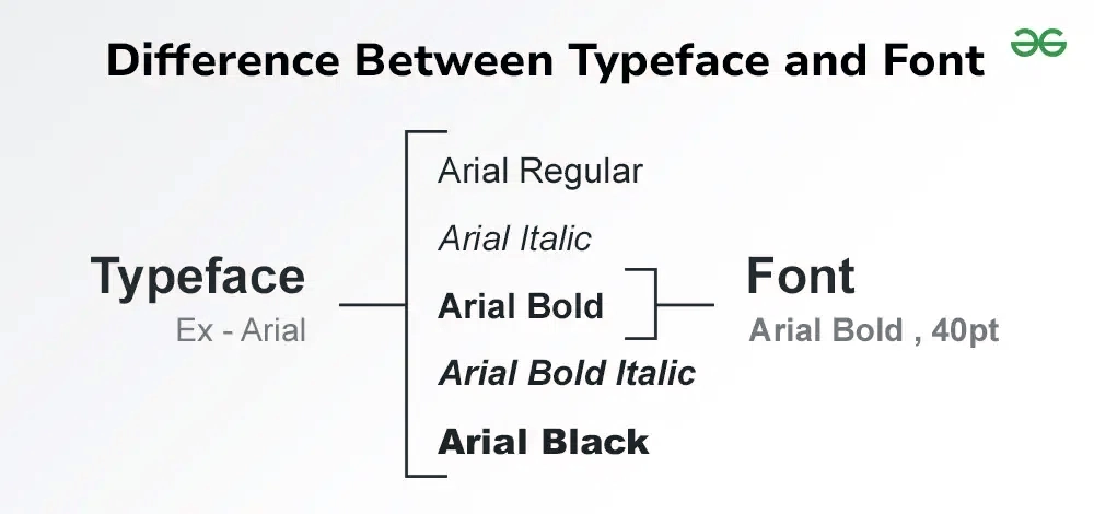
The two terms are often confused. The distinction goes back to metal typesetting: the typeface was the overall design — the complete graphic family, e.g. Helvetica, Inter — while the font was the physical material actually “cast” to print that design at a specific size and weight.
In digital work, the font is the computer file that instantiates the typeface: Arial Regular and Arial Bold are two fonts of the same typeface (Inter-Bold.woff2 is a font of the Inter typeface). Not to be confused with typography either — the art and technique of composing and laying out text, the broader field that encompasses the design and use of typefaces.
Source: 99designs — Typeface vs font: what's the difference?
Typeface Classification
| Family | Subcategory | Character |
|---|---|---|
|
SANS No serifs. Modernity, neutrality. Dominant in UI. |
Humanist Sans | Friendly, natural, readable, warm |
| Grotesque (clean) | Neutral, practical, professional | |
| Geometric (clean) | Modern, minimalist, structured | |
| Rounded Sans | Soft, playful, approachable | |
|
SERIF With serifs. Tradition, authority. Dominant in print & editorial. |
Humanist (Old Style) | Traditional, warm, literary |
| Transitional | Classic, authoritative, editorial | |
| Modern (Didone) | Luxury, fashion, dramatic, high contrast | |
|
SLAB Thick rectangular serifs. |
Humanist Slab | Friendly but solid, readable |
| Grotesque Slab | Strong, bold, newspaper style | |
| OTHER | Monospace | Technical, code, mechanical |
| Script / Handwritten | Personal, expressive, informal |
Quick Pairing Guide
| Heading typeface | Body typeface | Why it works |
|---|---|---|
| Geometric Sans | Humanist Serif | Modern contrast + readable |
| Neo-Grotesque Sans | Transitional Serif | Editorial / professional |
| Slab Serif | Humanist Sans | Strong heading + clean text |
| Modern Serif | Minimal Sans | Luxury / fashion aesthetic |
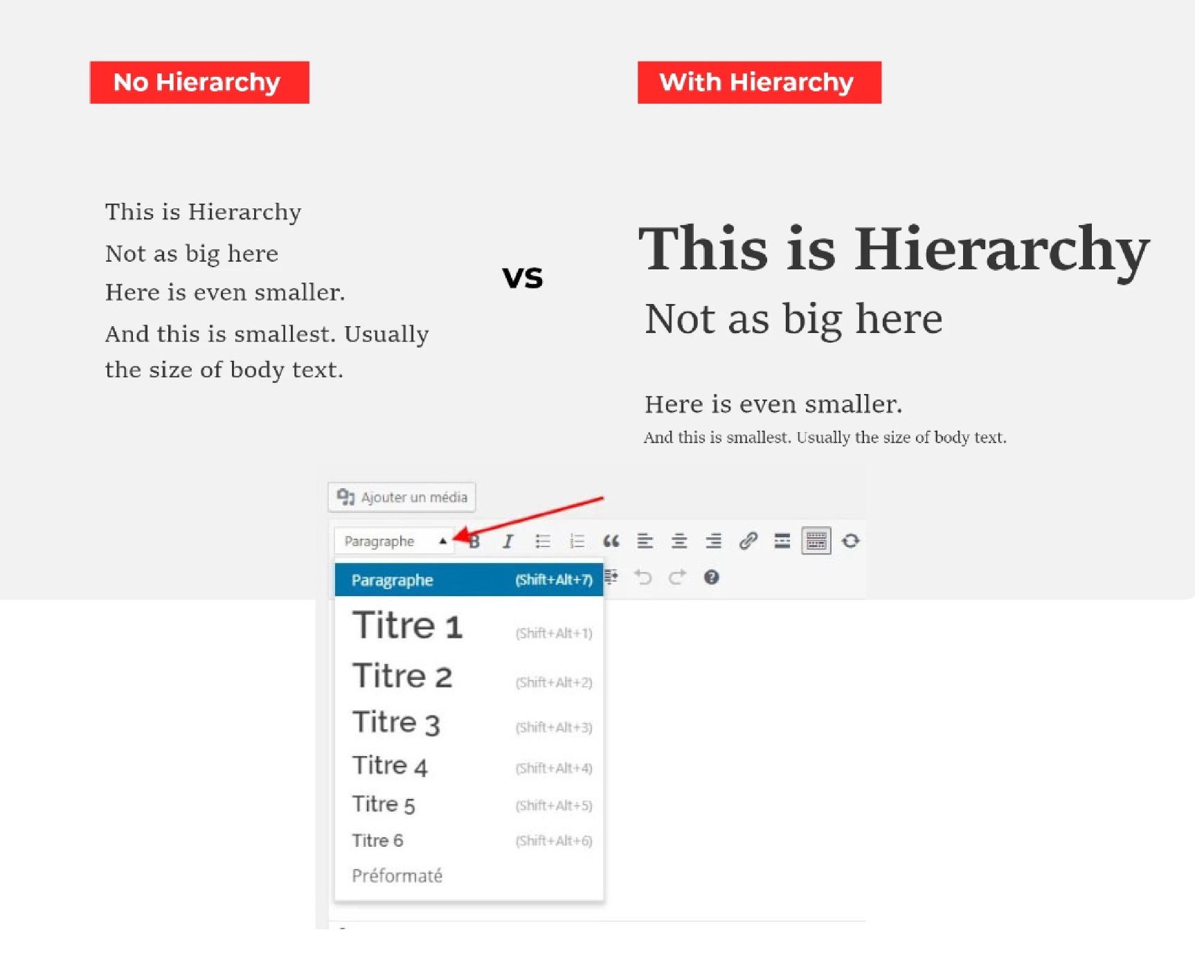
Typographic Hierarchy
| Level | Size | Usage |
|---|---|---|
| H1 | 32–64 px | Main page title |
| H2 | 24–40 px | Section heading |
| H3 | 20–28 px | Subsection heading |
| Body | 16–18 px (never < 14 px on the web) | Running text |
| Caption / Small | 12–14 px | Captions, notes |
| Label / Overline | 12–14 px, often uppercase | Field labels, tags |
Readability Rules
| Property | Recommendation |
|---|---|
| Line length | 45–75 characters per line (ideal: 60–70) |
| Line height | 1.4 to 1.6× for body · 1.1 to 1.3× for headings |
| Letter spacing | 0 on body (let the font breathe) · Positive on uppercase |
| Font weight | Skip at least 2 weights for contrast (400→600, not 400→500) |
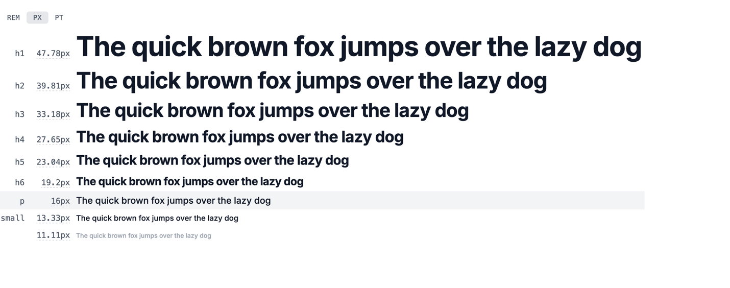
Modular Scale
A mathematical system for consistent sizes. Multiply the body size by a ratio.
| Ratio | Name | Effect |
|---|---|---|
| 1.125 | Major Second | Very subtle |
| 1.250 | Major Third | Balanced |
| 1.333 | Perfect Fourth | Pronounced |
| 1.500 | Perfect Fifth | High contrast |
| 1.618 | Golden Ratio | Dramatic |
Tool: typescale.com
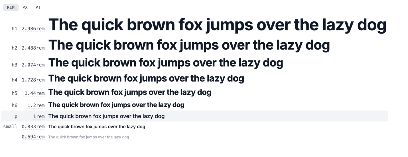
Pixels vs rem
The rem (Root EM) is a
relative unit based on the font size of
the root html element (16px by
default in browsers). Unlike the pixel (a fixed
unit), rem adapts to the user's accessibility
preferences and makes global interface scaling
easy.
| Unit | Type | Recommended usage |
|---|---|---|
| px | Absolute | Borders, shadows, strictly fixed-size elements |
| rem | Relative (root) | Text sizes, spacing — respects user preferences |
| em | Relative (parent) | Padding/margin relative to the local component's size |
| % | Relative (parent) | Layouts, responsive widths |
Visual Hierarchy
The order in which the eye perceives elements. Always guide the user toward the most important action.
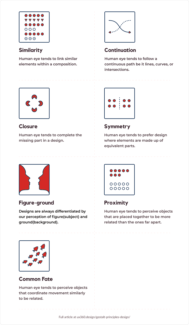
Gestalt Principles
A theory from the psychology of perception (German school, early 20th century). The Gestalt principles describe how the brain automatically groups visual elements.
Ref.: reallygooddesigns.com — Gestalt in UI/UX
The CRAP Principles
| Letter | Principle | Application |
|---|---|---|
| C | Contrast | Make what's different look different. Don't be afraid of bold contrast. |
| R | Repetition | Reuse visual elements to create consistency (colors, shapes, spacing). |
| A | Alignment | Nothing placed arbitrarily. Everything aligned to a grid or to another element. |
| P | Proximity | Group what's related, separate what isn't. |
Ref.: Digital Learning Institute — CRAP Principles
Balance and White Space
| Concept | Description |
|---|---|
| Symmetrical balance | Elements balanced on both sides of an axis. Formal, stable. |
| Asymmetrical balance | Balance through visual weight, not mirroring. Dynamic, modern. |
| White space | Empty space isn't really empty — it structures. The more you add, the more the content breathes. Classic mistake: not adding enough. |
Grids
| Type | Description |
|---|---|
| Column grid | Standard 12 columns for the web (divisible by 1, 2, 3, 4, 6) |
| Baseline grid | Vertical rhythm for typography |
| 8pt grid | All spacing in multiples of 8. The industry standard since Material Design. Mobile can use 4pt for finer precision. |
Squint at your design (or apply a blur). If the hierarchy still reads → good. If everything blends together → rework the hierarchy.
Rule of Thirds & Golden Ratio
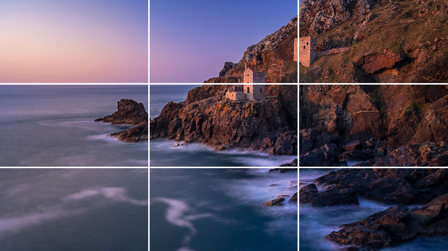
The rule of thirds divides space into a 3×3 grid. Placing key elements at the intersections naturally captures attention. Apply: place the primary CTA in the upper-right third · use the third lines to build visual hierarchy.
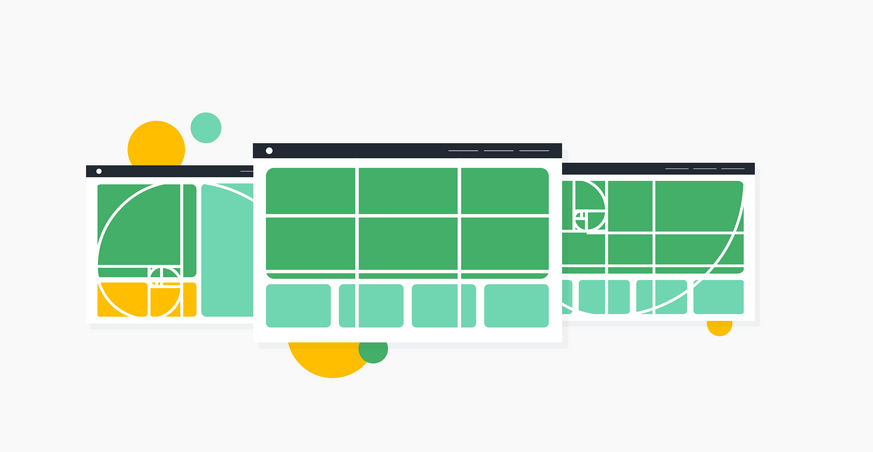
The golden ratio (φ ≈ 1.618) produces naturally harmonious proportions. Apply: sidebar/content ratio (38/62%) · spacing between sections · typographic proportions.
These principles are guides, not absolute rules. They help you make defensible decisions — but context, content, and intent can justify departing from them.
Components & Interactions
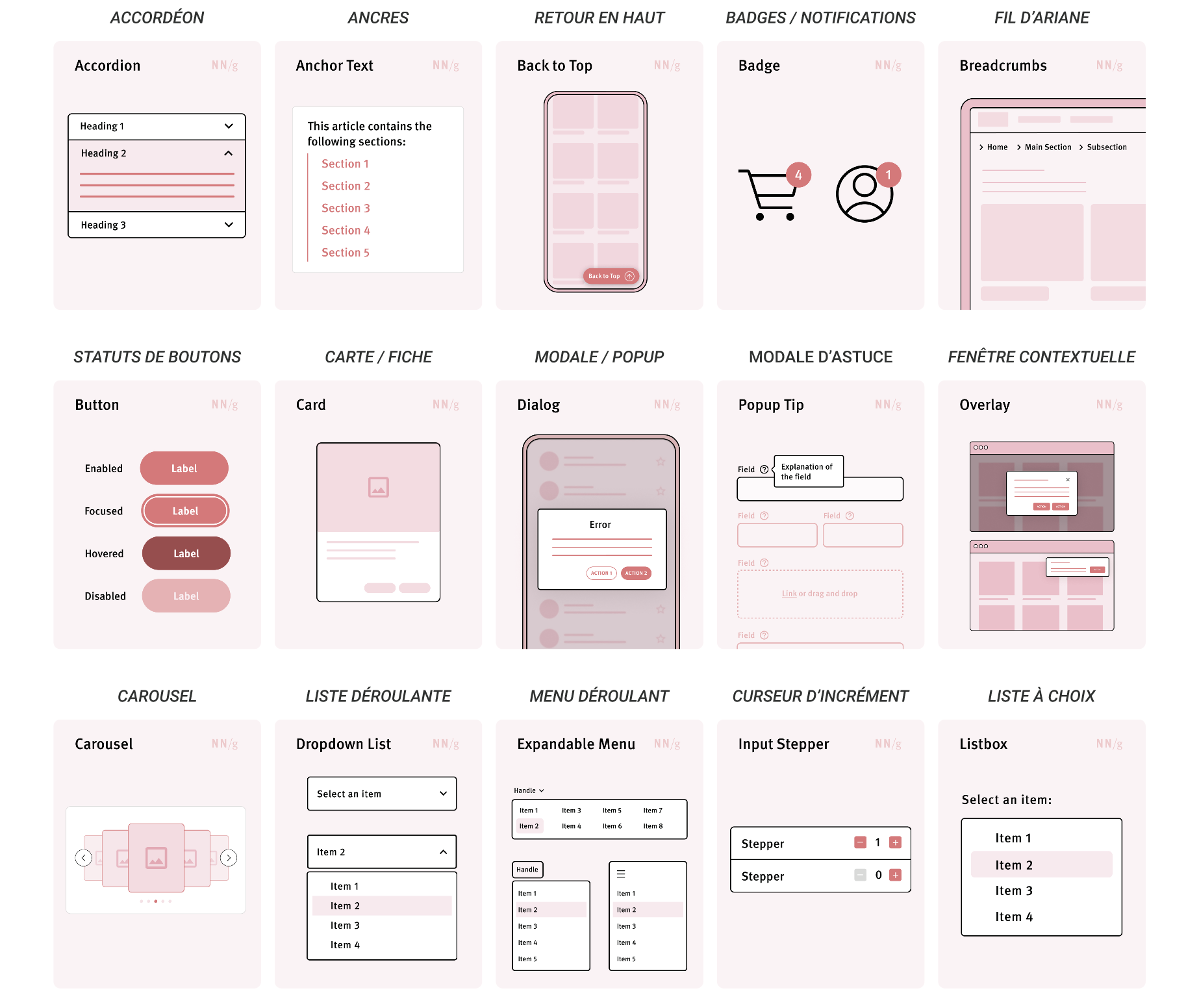
UI Element Categories
| Category | Elements |
|---|---|
| Input | Text field · Textarea · Checkbox · Radio button · Toggle/Switch · Dropdown · Date picker |
| Action | Button (primary, secondary, tertiary, ghost) · Link · Icon button |
| Navigation | Navbar · Sidebar · Breadcrumb · Tabs · Pagination · Hamburger menu |
| Content display | Card · List · Table · Accordion · Carousel · Tooltip · Badge · Avatar |
| Feedback | Toast / Snackbar · Modal / Dialog · Alert / Banner · Progress bar · Spinner |
Conventions (Jakob's Law)
- Logo top left → returns to home
- Search at the top · Account/profile top right
- Cart top right (e-commerce)
- Horizontal main navigation (desktop) or hamburger/bottom nav (mobile)
- Primary button on the right in action pairs (Western web)
- Footer for secondary and legal links
Minimum 44 × 44 px on mobile (Apple HIG recommendation, WCAG 2.2). Enough spacing between clickable targets. Related to Fitts's Law.
Interaction Design (IxD)
The discipline that studies how users interact with a product. Covers: behaviors, transitions, animations, response times, feedback. The interface's “behavior”, as opposed to its static appearance.
The 5 dimensions of IxD (Crampton Smith / Silver)
| Dimension | Examples |
|---|---|
| Words | Labels, microcopy |
| Visual representations | Icons, graphics |
| Physical objects / space | Mouse, touchscreen, gestures |
| Time | Animation, sound, duration |
| Behavior | The system's response |
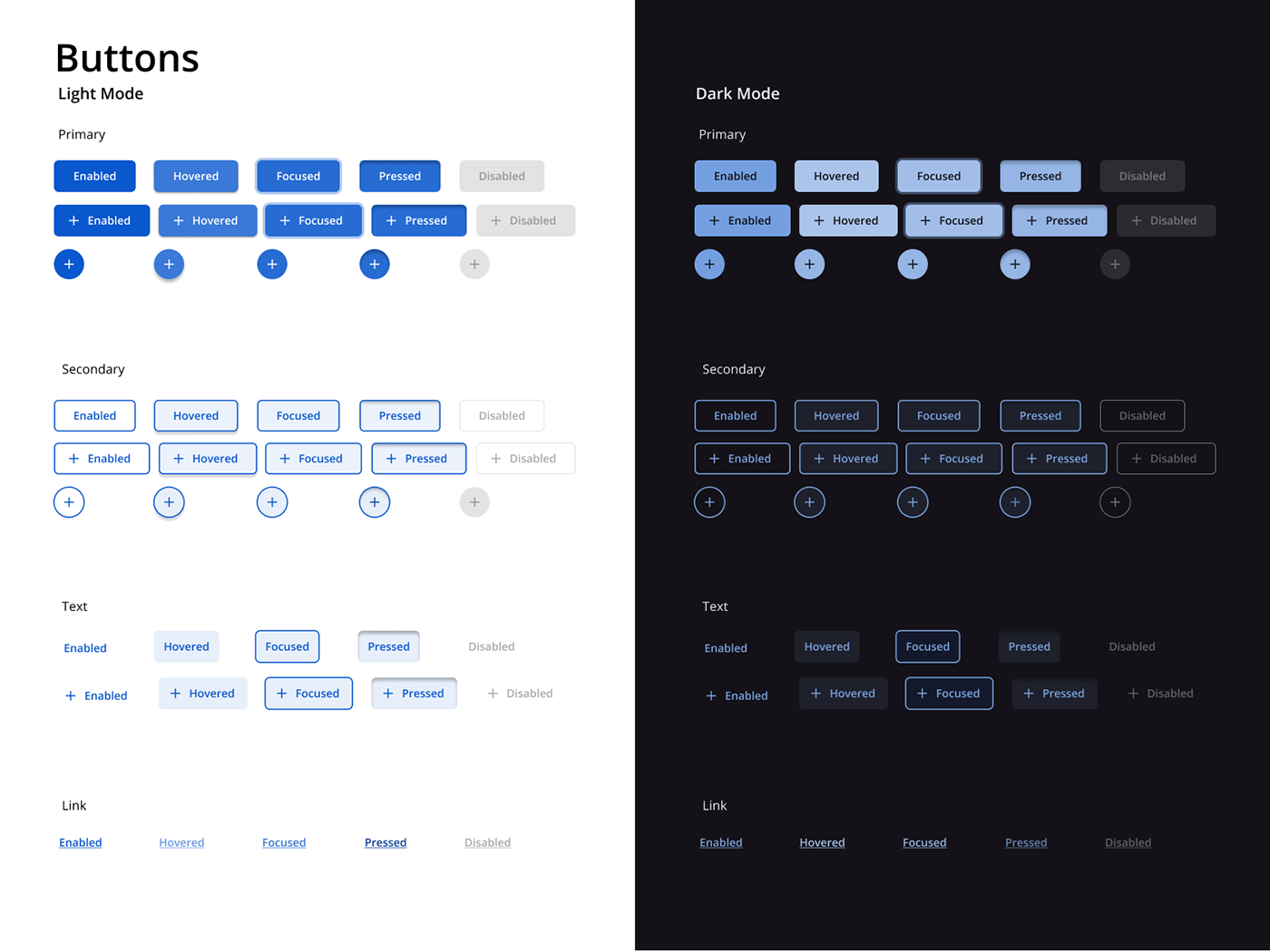
Component States
A component is not a static image — it's a set of states. Beginners design the “default” and forget the rest. Every state must be designed, documented, and handed off to the dev.
| State | Description |
|---|---|
| Default | Resting state |
| Hover | Cursor over the element (desktop only) |
| Active / Pressed | During the click |
| Focus | Keyboard-selected — critical for accessibility |
| Disabled | Unavailable |
| Loading | Processing |
| Error | Error state (form fields) |
| Success | Validation state |
| Selected / Checked | For selectable elements |
Microinteractions
Small functional animations that respond to an action. Formalized by Dan Saffer (Microinteractions, 2013). They bring the interface to life, provide feedback, and create delight.
| Component | Description |
|---|---|
| Trigger | What sets it off |
| Rules | What happens |
| Feedback | What the user sees / hears / feels |
| Loops & Modes | What happens over time |
Examples: A switch toggle that slides · An animated “like” button · Pull-to-refresh · Real-time validation · Haptic feedback on a successful payment
Best practices: Fast (200–400 ms) · Not distracting · Functional before decorative
Transitions and Animation
Provide a sense of continuity and place. Principles: easing (never linear) · duration · direction. References: Material Design and the Apple HIG document motion standards.
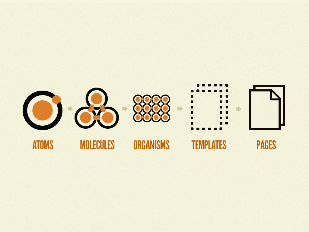
Atomic Design
A methodology for structuring an interface system proposed by Brad Frost (Atomic Design, 2013). Inspired by chemistry — interfaces are built from combinable elements.
| Level | Definition | Examples |
|---|---|---|
| 1. Atoms | Indivisible blocks | Button, label, input, icon, color, font |
| 2. Molecules | A combination of a few atoms | Search field (input + button) · Form field (label + input + error) |
| 3. Organisms | Complex, self-contained sections | Header · Footer · Card grid · Complete form |
| 4. Templates | Organisms arranged into a page structure | Layout with placeholder content |
| 5. Pages | Concrete instances of templates | Real content — where you test whether the system works |
Design Systems
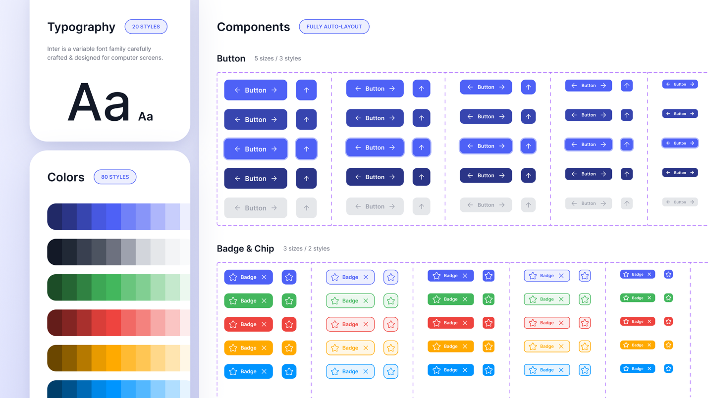
A complete set of standards, components, principles, and documentation for designing consistently. Broader than a component library — it includes usage rules and philosophy. The single source of truth for designers and developers.
| Layer | Contents |
|---|---|
| Foundations | Colors · Typography · Spacing (8pt) · Grids · Iconography · Elevation · Motion |
| Components | Buttons, inputs · Cards, modals, accordions · Patterns (forms, tables, nav) — all with variants and states |
| Documentation | When and how to use · Do's and don'ts · Accessibility notes (ARIA) · Code examples |
Design Tokens
The lowest abstraction layer of a design system. Values named semantically rather than literally.
-
color-primary-500instead of#3B82F6 -
space-4instead of16px - Enables theming (dark mode, multi-brand) and cross-platform consistency
- Key rule: never a raw value in a component — always a token
Reference Design Systems
| System | Company | Specialty |
|---|---|---|
| Material Design | The most complete, multi-platform | |
| Human Interface Guidelines | Apple | iOS, macOS |
| Carbon | IBM | Enterprise |
| Polaris | Shopify | E-commerce |
| Atlassian Design System | Atlassian | SaaS / productivity |
| Fluent | Microsoft | Enterprise, Office |
Advanced resource: Shopify — Web Components API
Accessibility & Universal Design
Roughly 15–20% of the population lives with a permanent or temporary disability (WHO). The “curb-cut effect”: what helps people with disabilities improves the experience for everyone.
Definition
WCAG = Web Content Accessibility Guidelines · Published by the W3C · Current version: WCAG 2.2 (October 2023) · The legal standard in most jurisdictions.
| Level | Description |
|---|---|
| A | Minimum — often legally insufficient |
| AA | The legal standard in most countries. The default target level. |
| AAA | Excellence — hard to achieve across the board |
The 4 POUR Principles
Alt text · Captions · Sufficient contrast · Don't rely on color alone
Keyboard navigation · No flashing content · Enough time · Touch targets ≥ 44×44 px
Plain language · Predictable behavior · Clear validation · Consistent navigation
Screen readers · Semantic HTML · ARIA when necessary
Essential Criteria in UI Design
| Criterion | Rule |
|---|---|
| Contrast — normal text | Minimum ratio 4.5:1 |
| Contrast — large text | Minimum ratio 3:1 (18pt+ or bold 14pt) |
| Contrast — UI elements | Minimum ratio 3:1 |
| Text size | Minimum 16 px for body text on the web |
| Touch targets | Minimum 44 × 44 px |
| Visible focus | Criterion 2.4.7 (AA) — visible focus indicator. New in 2.2: 2.4.11 “Focus Not Obscured” |
| Keyboard navigation | Every action reachable without a mouse · Logical tab order · Skip links |
| Heading structure | Correct H1→H2→H3 hierarchy, no skipping |
| Alt text |
On all informative images ·
Decorative images:
alt=""
|
| Color alone | Never use color alone — color + icon + text |
| Resizing | Content readable at 200% zoom without breaking |
| Motion |
Respect
prefers-reduced-motion
· No flashing > 3×/sec
|

WCAG Resources
- W3C WCAG 2.2 — Official reference
- WebAIM — Plain-language guides and tools
- A11y Project — Practical checklists
- WAVE — Page audit tool
Legal Obligations
| Law | Territory |
|---|---|
| EAA (European Accessibility Act) | EU — in force since June 2025 |
| ADA | USA — federal and state laws (California is strict) |
| AODA | Ontario — compliance required |
| LAA / Law 25 | Quebec — protection and accessibility |
An inclusive design approach that aims to design for user diversity from the very start. More philosophical than WCAG, but complementary. Key difference: accessibility makes a product accessible after the fact — universal design designs for diversity from the beginning.
| # | Principle | UI application |
|---|---|---|
| 1 | Equitable use | One experience that works for everyone |
| 2 | Flexibility in use | Customization, settings, alternatives (scroll speed, text size) |
| 3 | Simple and intuitive | Clear hierarchy, plain language, conventions respected |
| 4 | Perceptible information | Color + text + icon · Captions · Alt text |
| 5 | Tolerance for error | Undo · Confirmation before deletion · Real-time validation |
| 6 | Low physical effort | Autocomplete · Shortcuts · Smart defaults |
| 7 | Size and space | Touch targets ≥ 44 px · Zoom · Enough spacing between targets |
Figma Accessibility Plugins
- Stark — The standard. Contrast, color-blindness simulation, low vision
- A11y Annotation Kit — Annotate accessibility considerations for handoff
- Able — Quick contrast checking
- Color Blind Simulator — Test palettes in color-blind modes
Testing & Validation
A design is never finished when the designer thinks it's done — it's finished when users validate it. 5 users uncover roughly 85% of usability problems (Jakob Nielsen).
Definition
Representative users complete specific tasks with a prototype or product. You observe what they do, listen to what they say, and measure the results.
| Variant | Description | Advantages |
|---|---|---|
| Moderated | A facilitator guides the session, asks questions | Analytical depth, can probe the “why” |
| Unmoderated | The user completes tasks alone | Faster, cheaper, more participants |
| Remote | Via Zoom + screen sharing | More accessible, scalable, less biased |
| In person | In a lab or at the user's location | Observe body language and the real environment |
How to Structure a Test
| Step | Action |
|---|---|
| 1. Objective | What do we want to validate? Hypotheses to test. Tasks to complete. |
| 2. Recruiting | 5 representative users per profile (Nielsen) · A clear screener · Compensation |
| 3. Protocol | Scenario-based tasks (“You want to buy a gift…”) · Pre- and post-test questions |
| 4. Session | Think-aloud method · Observe without helping · 30–60 min |
| 5. Analysis | Friction patterns · Quotes · Metrics · Prioritize by severity |
Usability Metrics
| Metric | Description |
|---|---|
| Task success rate | % of users who complete the task |
| Time on task | Time to complete a task |
| Error rate | Number of errors per task |
| SUS | System Usability Scale — 10 questions, scored out of 100. The standard since 1986. |
| SEQ | Single Ease Question — 1 question (perceived ease), 1–7 scale. Fast and reliable. |
| NPS | Net Promoter Score — likelihood to recommend, 0–10 scale. |
Tools: Maze · UserTesting · Lookback · Useberry · Optimal Workshop
Heuristic Evaluation
An expert review method (not user-based). Uses Nielsen's 10 heuristics as the analysis grid. Fast, inexpensive, and complementary to user testing. Popularized by Nielsen and Molich (1990).
| Severity | Description |
|---|---|
| 0 | Not a problem |
| 1 | Cosmetic problem |
| 2 | Minor problem |
| 3 | Major problem, high priority |
| 4 | Catastrophe, must absolutely be fixed |
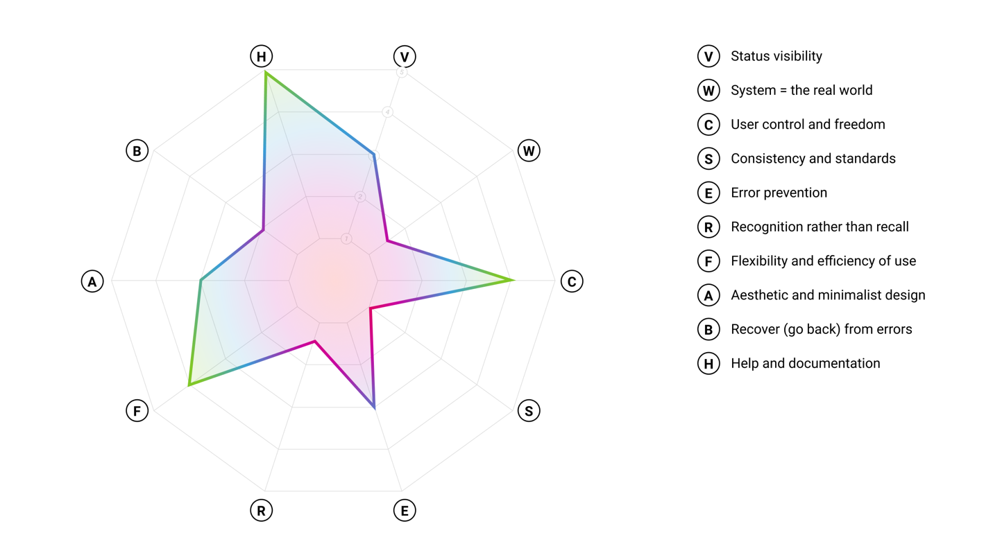
Radar Chart (Spider Graph)
A visualization of the results — 10 axes (one per heuristic), scored 0 to 5. The polygon shape reveals strengths and weaknesses at a glance. Useful for fast visual communication, before/after comparisons, and competitive benchmarks.
Tree Testing
Validates a tree structure without any visual interface. The user navigates the label structure to find a target item. Lets you test the IA before wireframing.
| Metric | Description |
|---|---|
| Success rate | % of users who found the right location |
| Directness | % who found it without backtracking |
| Time | Time to find it |
Tools: Treejack · UXtweak · Maze
Card sorting = build
the tree (generative)
Tree testing
= validate the tree (evaluative)
First-Click Test
Measures where users click first to complete a task. The first click is critical: if it's right, the user has an 87% chance of completing the task (Bailey, 2008). If it's wrong, the odds drop to 46%.
5-Second Test
Show a page for 5 seconds, then hide it. Ask what the user remembers. Evaluates clarity and first impression. Especially useful for landing pages and value propositions.
Session Recording
Tools that automatically record what real users do on the production product. Passive, unscripted observation. A source of quantitative and qualitative behavioral data.
| Type | Description |
|---|---|
| Heatmaps — Click maps | Most-clicked areas |
| Heatmaps — Scroll maps | How far users scroll |
| Heatmaps — Move maps | Where the mouse moves (a proxy for attention) |
| Session recordings | Anonymous session video — detects rage clicks, dead clicks, erratic scrolling |
| Funnels | Conversion path tracking — identifies drop-offs at each step |
| Form analytics | Which fields take time or cause drop-off |
Tools: Hotjar · FullStory · Microsoft Clarity (free) · Smartlook · Mouseflow
Comply with GDPR / Law 25 · Mandatory anonymization · Disclosure in the privacy policy · Allow opt-out
Figma
Frame vs Group
| Frame | Group |
|---|---|
| Self-contained container | Simple grouping |
| Accepts Auto Layout | No Auto Layout |
| Accepts constraints | No constraints |
| Can clip content | No clipping |
| Can have fill, stroke, radius | Neutral appearance |
| Required for responsive work | Reserved for temporary grouping |
Almost always a Frame, except for specific temporary grouping cases.
Sizing Modes
| Mode | Behavior | Typical case |
|---|---|---|
| Fixed | Fixed size in pixels | Sidebar (fixed 320px width) |
| Hug contents | Size adapts to the content | A button that “hugs” its text |
| Fill container | Fills the parent | An element that takes the full width |
Auto Layout — Core Concepts
Figma's most powerful tool. Mirrors the logic of CSS Flexbox. Essential for reusable components and responsive work.
| Property | Description |
|---|---|
| Direction | Horizontal (row) · Vertical (column) · Wrap (flows to next line) |
| Padding | The frame's inner space (top/right/bottom/left) |
| Gap | Space between child elements (can be negative) |
| Alignment | 9 possible positions |
| Distribution | Packed (together + gap) vs Space Between (spread across the full width) |
Typical practical cases
| Element | Sizing |
|---|---|
| Button | Hug × Hug (adapts to its text) |
| Header | Fill × Hug (full width, height adapts) |
| Sidebar | Fixed × Fill (fixed width, takes full height) |
| Card | Fixed × Hug (width 320, height from content) |
Essential Mental Models
| Concept | What it is | Why it matters |
|---|---|---|
| Frames vs. Groups | Frames behave like browser viewports — they clip content, define responsive constraints, and are required for Auto Layout. Groups are just organizational folders. | Use frames by default. |
| Auto Layout | Figma's implementation of CSS flexbox. Set the direction (row/column), gap, and padding. Child elements resize and reflow predictably. | Every component should use Auto Layout — it's the only way designs hold up at different content lengths. Master it first. |
| Components & Instances | A component is the source of truth. Instances inherit changes but can override individual properties (text, color, visibility). | Edit the component → every instance updates. Override an instance → it keeps its override. That's the whole logic of a design system. |
| Styles & Variables | Styles store reusable values. Variables (2023+) are the design token layer — they support modes (light/dark) and enable semantic naming. | Use variables for anything that must change across themes or breakpoints. Exportable for developer handoff. |
| Prototype flows | Connections between frames triggered by interactions. Set the trigger (click, hover), the animation (Smart Animate, dissolve), and the destination. | Smart Animate interpolates between matching layer names — name layers consistently or transitions break. |
Terminology
| Notion | Description |
|---|---|
| Component (Main) | The source component — solid purple diamond |
| Component Set | A group of variants of the same component |
| Instance | A copy linked to the main component — hollow diamond |
| Detached instance | An instance that lost its link — to be avoided |
The 4 Property Types
| Type | Usage | Example |
|---|---|---|
| Boolean | Toggles an element on / off | Show/hide an icon inside a button |
| Instance Swap | Replace a nested instance | Change a button's icon without diving into it |
| Text | Edit text from the panel | A button's label |
| Variant | Pick among predefined variants | Choose a button's Size or Style |
Essential Shortcuts
Styles vs Variables
| Styles | Variables |
|---|---|
| Predate variables | Introduced in 2023 |
| Fills, text, effects, grids | Atomic values (color, number, string, boolean) |
| No modes | Modes (light/dark, mobile/desktop, languages) |
| No aliases | Aliases (a variable pointing to another) |
Layered Architecture (Semantic Aliasing)
| Layer | Example |
|---|---|
| Primitives (raw values) |
blue-500: #3B82F6 ·
gray-100: #F3F4F6
|
| Semantic (roles) |
color-primary: blue-500
·
color-background:
                                                gray-100
|
| Component (very specific) |
button-primary-bg:
                                                color-primary
|
Changing a primitive updates the whole chain. Enables dark mode without duplication. Clear design ↔ dev communication.
Modes — Light/Dark Example
- Create a “Colors” collection
- Add modes: Light, Dark
- Create semantic variables (background, text-primary, border…)
- Set different values per mode
- Apply them to components
- Switch the mode on the root frame → the whole interface flips
Interactions
| Triggers | Actions |
|---|---|
| On click / tap · On hover · On press · While hovering · Mouse enter/leave · After delay · Key press | Navigate to · Change to (state) · Open overlay · Close overlay · Back · Scroll to · Open link · Set variable · Conditional |
Animations
| Animation | Usage |
|---|---|
| Smart Animate | Automatically interpolates between elements with matching names. Very powerful for microinteractions. |
| Dissolve | Crossfade between two frames |
| Move in / out · Push · Slide | Directional transitions |
Microinteractions: 200–400 ms · Page transitions: 300–500 ms · Easing: always ease-in-out or spring — never linear.
Glossary
Resources
Every link and source cited on this site, grouped by category.
References & Readings
| Resource | Topic |
|---|---|
| NN/g — 10 Usability Heuristics | Nielsen’s 10 heuristics (1994) |
| NN/g — Heuristic Evaluation Summary (PDF) | PDF summary of the heuristics |
| NN/g — UX Mapping Cheat Sheet | Personas, journey maps, experience maps, mental models |
| NN/g — UX vs UI | Video — the UX / UI distinction |
| Laws of UX | Psychological laws applied to design |
| Growth.Design — Psychology | Cognitive biases illustrated with case studies |
| deceptive.design | Catalog of dark patterns |
| DAPDE — Dark Patterns | Types and examples of dark patterns |
| Really Good Designs — Gestalt | Gestalt principles in UI/UX |
| CareerFoundry — UX vs UI | UX / UI difference in plain language |
| CareerFoundry — SCAMPER | SCAMPER ideation technique (video ▶) |
| UX Design Institute — STAR Method | Research planning framework |
| Maze — Affinity Diagrams | Affinity diagram guide |
| Digital Learning Institute — CRAP | Contrast, Repetition, Alignment, Proximity |
| Twine — Example UX Project Brief | A real UX brief example |
| 99designs — Typeface vs Font | The typeface / font / typography distinction |
| Figma Blog — Config 2025 | Make, Sites, Draw, Buzz announcements |
| Shopify — Web Components API | Advanced design-system → code resource |
Design Tools
| Tool | Purpose |
|---|---|
| Figma | Industry standard — UI, prototyping, design systems |
| Sketch | UI design pioneer (Mac only) |
| Adobe XD | Sunset since 2023 |
| Penpot | Open-source, self-hostable alternative |
| Typescale | Modular type scale generator |
Research, Testing & Analytics
| Tool | Purpose |
|---|---|
| Maze | Unmoderated usability testing |
| Optimal Workshop · Treejack | Card sorting, tree testing |
| Hotjar | Heatmaps, session recordings, surveys |
| Google Analytics | Web analytics — traffic, conversions |
| Microsoft Clarity | Heatmaps and recordings (free) |
| Mobbin | Mobile app patterns, sortable by screen |
| Page Flows | Videos of real user flows |
| Octopus.do | Sitemaps and augmented sitemaps |
| FlowMapp | Sitemaps, user flows, UX planning |
Reference Design Systems
| System | Company |
|---|---|
| Material Design 3 | Google — the most complete, multi-platform |
| Human Interface Guidelines | Apple — iOS, macOS |
| Carbon | IBM — enterprise |
| Polaris | Shopify — e-commerce |
| Atlassian Design System | Atlassian — SaaS / productivity |
| Fluent | Microsoft — enterprise, Office |
Accessibility
| Resource | Purpose |
|---|---|
| W3C — WCAG 2.2 | Official reference |
| WebAIM · Contrast Checker | Plain-language guides, contrast checking |
| A11y Project | Practical checklists |
| WAVE | Page audit tool |